- Introduction
- 1. What do you get ?
- 2. The Theme
- 3. Installation
- 4. Dummy Data
- 5. Setup
- 6. Theme Options Panel
- 7. Visual Composer
- 8. Credits
- 9. FAQ
- Published using GitBook
About Us
About Us Page of MyBag is built using Visual Composer.It has 10 rows. The Visual Composer Backend editor of the page look like this
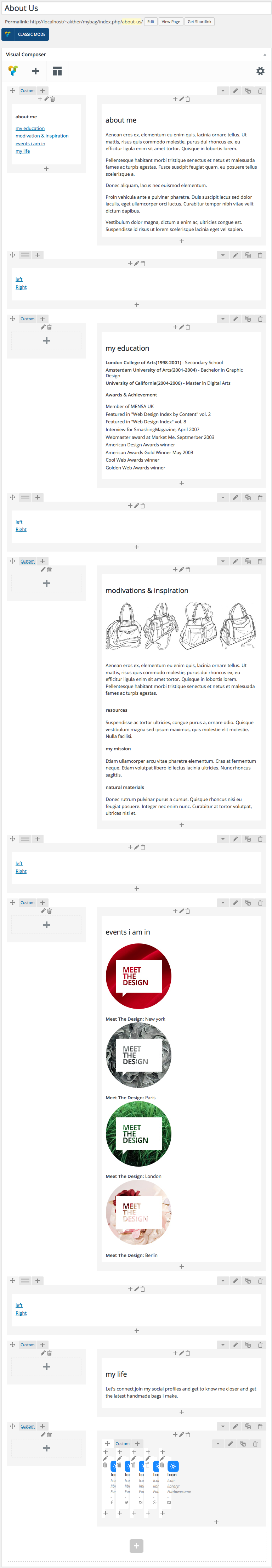
Content Section
Row 1
- It has two columns in the ratio 1/3 : 2/3.
Column 1 (1/3)
- It has a Text Block element.
- Text Block : The content of the text block:
<div id="Scrollspy">
<div id="sidebar" class="sticky-sidebar top sticky">
<div class="widget">
<div class="widget-body">
<ul class="nav tabs-left">
<li><a href="#about-me">about me</a></li>
<li><a href="#education">my education</a></li>
<li><a href="#modivation">modivation & inspiration</a></li>
<li><a href="#event">events i am in</a></li>
<li><a href="#life">my life</a></li>
</ul>
</div>
</div>
</div>
</div>
Column 2 (2/3)
- It has a Text Block element.
- Text Block : The content of the text block:
<div id="about-me" class="right-content">
    <div class="row">
        <div id="about-me" class="col-md-7 tab-pane">
        <h2>about me</h2>
        <p class="text">Aenean eros ex, elementum eu enim quis, lacinia ornare tellus. Ut mattis, risus quis commodo molestie, purus dui rhoncus ex, eu efficitur ligula enim sit amet tortor. Quisque in lobortis lorem.</p>
        <p class="text">Pellentesque habitant morbi tristique senectus et netus et malesuada fames ac turpis egestas. Fusce suscipit feugiat quam, eu posuere tellus scelerisque a.</p>
        <p class="text">Donec aliquam, lacus nec euismod elementum.</p>
        <p class="text">Proin vehicula ante a pulvinar pharetra. Duis suscipit lacus sed dolor iaculis, eget ullamcorper orci luctus. Curabitur tempor nibh vitae velit dictum dapibus.</p>
        <p class="text">Vestibulum dolor magna, dictum a enim ac, ultricies congue est. Suspendisse id risus ut lorem scelerisque lacinia eget vel sapien.</p>

        </div>
        <div class="col-md-5"><a href="#"><img src="http://demo2.transvelo.in/mybag/wp-content/uploads/2015/12/01.jpg" alt="" /></a></div>
    </div>
</div>
Row 2
- It has a Text Block element.
- Text Block : The content of the text block:
<div class="quick-scroll">
    <ul class="nav tabs-left">
        <li><a class="left-nav" href="#modivation">left</a></li>
        <li><a class="right-nav" href="#about-me">Right</a></li>
    </ul>
</div>
Row 3
- It has two columns in the ratio 1/3 : 2/3.
Column 2 (2/3)
- It has a Text Block element.
- Text Block : The content of the text block:
<div class="main-section education-block"> <div id="education" class="tab-pane"> <h2 class="topic">my education</h2> <ul class="list-of-education"> <li><strong>London College of Arts(1998-2001)</strong> - Secondary School</li> <li><strong>Amsterdam University of Arts(2001-2004)</strong> - Bachelor in Graphic Design</li> <li><strong>University of California(2004-2006)</strong> - Master in Digital Arts</li> </ul> <!-- /.list-of-education --> <h4 class="sub-topic inner-top-50">Awards & Achievement</h4> <ul class="awards-list"> <li>Member of MENSA UK</li> <li>Featured in "Web Design Index by Content" vol. 2</li> <li>Featured in "Web Design Index" vol. 8</li> <li>Interview for SmashingMagazine, April 2007</li> <li>Webmaster award at Market Me, Septmerber 2003</li> <li>American Design Awards winner</li> <li>American Awards Gold Winner May 2003</li> <li>Cool Web Awards winner</li> <li>Golden Web Awards winner</li> </ul> </div> </div>Row 4
- It has a Text Block element.
- Text Block : The content of the text block:
<div class="quick-scroll">
<ul class="nav tabs-left">
    <li><a class="left-nav" href="#modivation">left</a></li>
    <li><a class="right-nav" href="#about-me">Right</a></li>
</ul>
</div>
Row 5
- It has two columns in the ratio 1/3 : 2/3.
Column 2 (2/3)
- It has a Text Block element.
- Text Block : The content of the text block:
<div class="main-section modivation-block">
<div id="modivation" class="tab-pane">
<h2 class="topic">modivations & inspiration</h2>
<div class="image"><img class="img-responsive" src="http://localhost/~akther/mybag/wp-content/uploads/2015/12/02.jpg" alt="" /></div>
<p class="text">Aenean eros ex, elementum eu enim quis, lacinia ornare tellus. Ut mattis, risus quis commodo molestie, purus dui rhoncus ex, eu efficitur ligula enim sit amet tortor. Quisque in lobortis lorem. Pellentesque habitant morbi tristique senectus et netus et malesuada fames ac turpis egestas.</p>
<div class="row modivation-types">
<div class="col-md-4">
<h4 class="title">resources</h4>
<p class="text">Suspendisse ac tortor ultricies, congue purus a, ornare odio. Quisque vestibulum magna sed ipsum maximus, quis molestie elit molestie. Nulla facilisi.</p>
</div>
<div class="col-md-4">
<h4 class="title">my mission</h4>
<p class="text">Etiam ullamcorper arcu vitae pharetra elementum. Cras at fermentum neque. Etiam volutpat libero id lectus lacinia ultricies. Nunc rhoncus sagittis.</p>
</div>
<div class="col-md-4">
<h4 class="title">natural materials</h4>
<p class="text">Donec rutrum pulvinar purus a cursus. Quisque rhoncus nisi eu feugiat posuere. Integer nec enim nunc. Curabitur at tortor volutpat, ultrices nisl et.</p>
</div>
</div>
</div>
</div>
Row 6
- It has a Text Block element.
- Text Block : The content of the text block:
<div class="quick-scroll">
<ul class="nav tabs-left">
    <li><a class="left-nav" href="#modivation">left</a></li>
    <li><a class="right-nav" href="#about-me">Right</a></li>
</ul>
</div>
Row 7
- It has two columns in the ratio 1/3 : 2/3.
Column 2 (2/3)
- It has a Text Block element.
- Text Block : The content of the text block:
<div class="main-section event-block">
<div id="event" class="tab-pane">
<h2 class="topic">events i am in</h2>
<div class="row meet-the-design-image text-center clearfix">
<div class="col-md-4 col-lg-3 col-sm-6">

<a href="#"><img src="http://localhost/~akther/mybag/wp-content/uploads/2015/12/mtd1.jpg" alt="" /></a>

<strong>Meet The Design:</strong> New york

</div>
<div class="col-md-4 col-lg-3 col-sm-6">

<a href="#"><img src="http://localhost/~akther/mybag/wp-content/uploads/2015/12/mtd2.jpg" alt="" /></a>

<strong>Meet The Design:</strong> Paris

</div>
<div class="col-md-4 col-lg-3 col-sm-6">

<a href="#"><img src="http://localhost/~akther/mybag/wp-content/uploads/2015/12/mtd3.jpg" alt="" /></a>

<strong>Meet The Design:</strong> London

</div>
<div class="col-sm-6 col-lg-3 hidden-md">

<a href="#"><img src="http://localhost/~akther/mybag/wp-content/uploads/2015/12/mtd4.jpg" alt="" /></a>

<strong>Meet The Design:</strong> Berlin

</div>
</div>
</div>
</div>
Row 8
- It has a Text Block element.
- Text Block : The content of the text block:
<div class="quick-scroll">
<ul class="nav tabs-left">
    <li><a class="left-nav" href="#modivation">left</a></li>
    <li><a class="right-nav" href="#about-me">Right</a></li>
</ul>
</div>
Row 9
- It has two columns in the ratio 1/3 : 2/3.
Column 2 (2/3)
- It has a Text Block element.
- Text Block : The content of the text block:
<div class="main-section social-block">
<div id="life" class="tab-pane">
<h2 class="topic">my life</h2>
<p class="text">Let's connect,join my social profiles and get to know me closer and get the latest handmade bags i make.</p>
</div>
</div>
Row 10
- It has two columns in the ratio 1/3 : 2/3.
Column 2 (2/3)
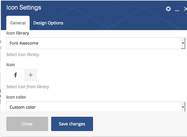
- It has a row with 5 columns in the ratio 1/12 + 1/12 + 1/12 + 1/12 + 1/12. Each columns has Icon settings.
Here is the screenshot for Icon Settings
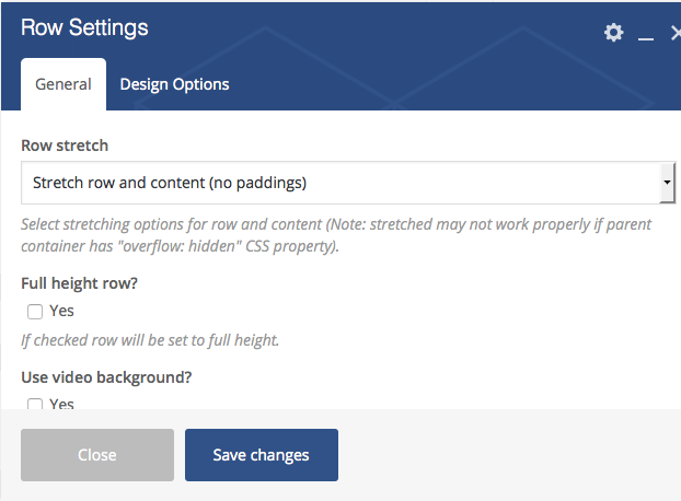
Note: In Row 2,Row 4, Row 6, Row 8 setting enable Stretch row and content (no paddings). Here i pasted the screenshot for your reference.